What sets Listen Haus apart from other design agencies is our ability to translate your goals into visuals. We believe that design, marketing, and your business goals are all interwoven. Separating your brand from your goals or marketing message is impossible.
What we are sharing isn't just for companies; it's also for artists, musicians, or anyone looking to promote themselves.
Brand vs. Branding: What's the difference?
The brand is the perception people have of you, the invisible interactions and feelings people when they interact with the brand. These opinions are built on the judgments of your audience. Many of these judgments are based on your branding, customer experience, and the intangible, experiential elements of a business.
Branding, on the other hand, is your visual identity. What people see when they interact with your business such as your logo, menu, website, or products. You could say that your brand is your style, it's like the clothes you wear. Right or wrong what you wear leaves an impression that says something about your core. The goal of your branding and marketing is to shape your perception to those who interact with the brand.
To do this, you must ask yourself what the essence of my brand is? What are my core values? How might my client perceive me?
There is a myriad of answers to these questions, but from your responses, a visual solution will emerge. This step is where most people get tripped up. They want a visual identity they describe as hipster, cool, or modern. These options say nothing unique about the brand and don't convey your brand values.
To communicate your brand a lot of self-reflection and story making needs to take place. After determining the core identity how do you describe this to your audience?
This is where storytelling through your graphics comes in. Art is just another language. Every word we use is a symbol. When spoken they are only sounds that represent something else. When written they are visual representations of the symbol. We all have intimate experience with every word we use. Every time you encounter a familiar word it is added to the experience and your understanding of it. We have all seen brands, interacted with them and each time a connection is made, consciously and subconsciously. Every piece of art you have seen, every movie you've watched, every commercial you've seen, and every business logo you've encountered has created an impression on you. This is why when you look at a generic brand logo the first thought is that it isn't a high-quality product compared to the name brand. We are hardwired to associate visuals with our experiences. It is essential for your visual identity to represent your core values, to reinforce your brand message, and to create a positive interaction.
We believe that your branding should not only visually identify you, but also symbolically reflect your core values.
Let's look at our branding to demonstrate these concepts.
Our Name:
The “Haus” is a reference to the German Bauhaus movement. A group that went above and beyond their time to create handcrafted art and design for a purpose. They studied visual techniques and form so that their products would be both appealing, functional, and contain depth.
Together we have a home where you can comfortably and honestly express yourself so that we all genuinely understand each other.
The significance of a universe to Listen Haus is the exploration of the unknown. When you set out to tell your story, you don’t know where you are going or what you are going to find. It is an adventure and a bit scary. But it is also something that you can learn about, something to study and be understood. It is something you want to share with others. Your discoveries must be shared!
Your story is a vast unknown filled with possibilities yet to be discovered.
Logo Design:

inspired by our galaxy and the universes beyond.
It represents the unknown yet to be explored. A total mystery filled with undiscovered beauty. It is a never-ending expanse of uncharted territory to be plotted and shared, yet also represents the eternal and unchanging aspects beyond humanity.
Based on the Bauhaus design the font represents the best parts of humanity striving to work together to create something beautiful and functional. We are looking to the past to inspire our future. Blending the beauty of the old with the endless possibilities of our future.
Versatile, simple, and functional it can be used in a variety of situations while remaining simple and iconic.
Typography

The typography choices reflect key historical and ideological beliefs we stand with. The unification of hand craftsmanship in an industrialized world and the scientific precision it takes to communicate clearly.
The fundamental belief of the Bauhaus was that fine art and craftsmanship could be used to solve problems in an industrialized world. Just as The Bauhaus were facing an industrial world, we also face an intricate web of connectivity and media. We aim to unite story with design like The Bauhaus united craft with functionality.
Pairing Bauhaus with Helvetica unites organic artistry with precise and clear communication. The simplicity and directness Helvetica provides a stable base for which Bauhaus can contrast. Both fonts work together to express the philosophy of Listen Haus.
Colors

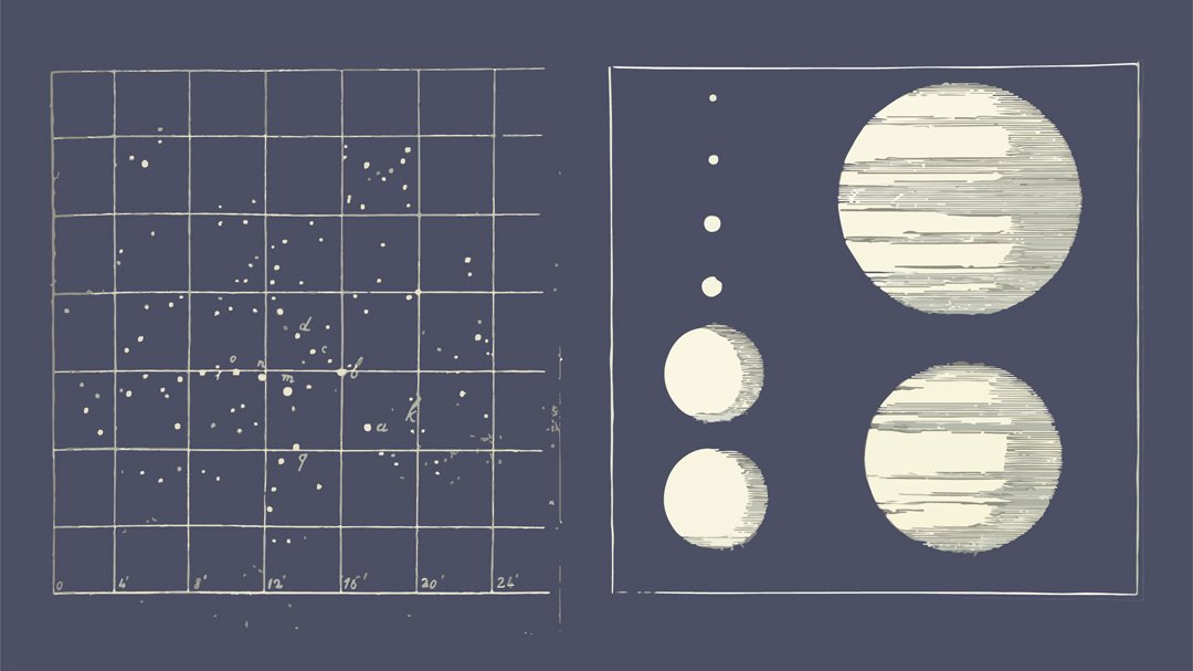
Our color pallet is inspired by old space and naval illustrations. They are meant to feel worn in and well used. Familiar and expansive these faded colors from old textbooks provide subtle tonal shifts when on light or dark backgrounds.
Each aspect of our brand symbolically communicates our values.
Check out our complete brand guidelines and contact us for more information about telling a story through your visual identity and marketing.

