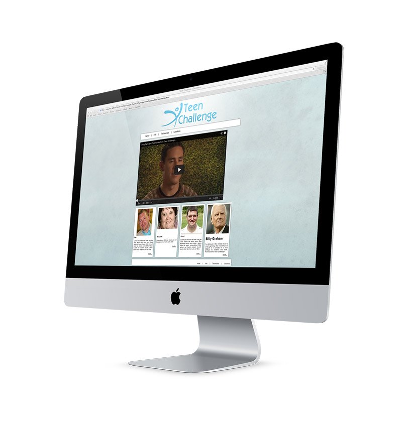
TEEN CHALLENGE
TEEN CHALLENGE REBRAND & MARKETING proof of CONCEPT
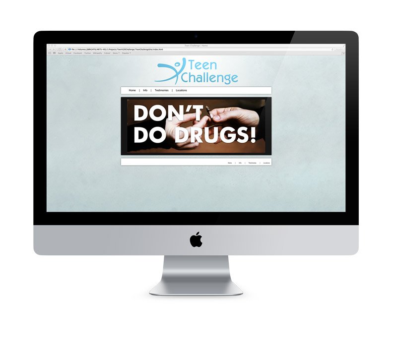
Teen Challenge is a national rehabilitation center that brings hope and healing to anyone in need that enters their doors. This concept rebrand was intended to keep a familiar edge to their old branding while bringing in a refreshing lively character for the viewer to identify with.
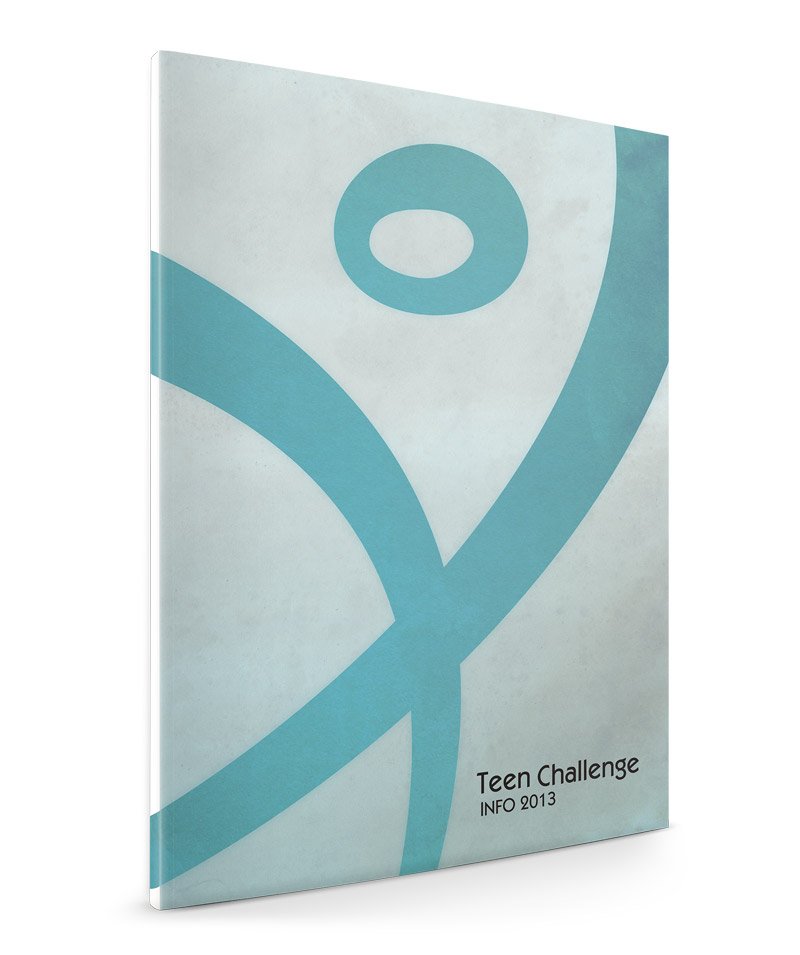
Blue being a calming and medical color represents a clean environment free from any addiction, the stick figure bursts with energy representing the growth that can occur by partnering with this this organization.
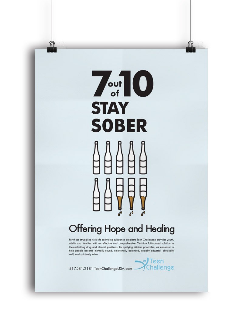
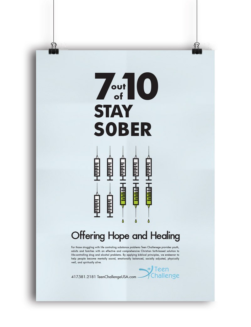
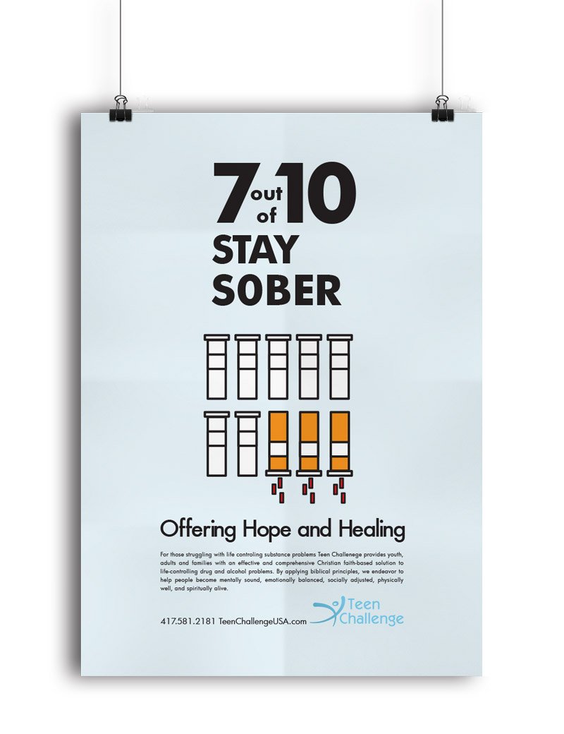
According to their statistics 7 out of 10 addicts that participate in their program remain clean after treatment. Using this statistic I developed a poster series that visually represents those who are addicted remain clean